Showing posts with label Artwork. Show all posts

Wednesday, September 12, 2012

Park City, UT - Easy Street Bar (sketch)

So for this sketch I tried to do the same blocky under-painting with the markers then apply the pen lines as I did with the the corner lamppost sketch (previous post) and the Knoxville butterflies.  It didn't work out as well, but I think that's largely because of the over-whelming black blobs (among other things).

I've told myself any number of times in the past few weeks: Do not use the black marker!  Use the 60% grays instead!

I should just throw the darn thing out.  THAT will keep me from using it!

Anyway, still working on this method.  (sigh)


Park City, UT - The Corner Lamppost (sketch)

While I was in Park City today I decided to work a bit more on that blocky sketch drawing similar to the butterflies of Knoxville.  This one turned out okay, but I know I need more practice at it.

Working with the limited color palette of the markers throws me off as well, as evidenced by the blue spruce that looks like Cruella deVille had a hand in color selection.  I should have used the muted blue colors I have and green tones be damned!  For some reason I continue to think that pale jade green marker (the one that looks almost white in the picture) is darker than what it actually is, even though I have a color key for the markers sitting right next to me.  One of life's mysteries.

I digress.

So. What am I trying to do?  Basically I'm throwing down blocks of color without any other lines what-so-ever to guide placement or proportion.  Then I overlay with india ink pen to create the sketch details.  It almost reminds me of those comic strips where the color blocking is offset from the lines.  There's potential in this style, I think, I just need to keep working at it.


Sunday, September 9, 2012

Roseburg, OR - Roseburg Painters (illustration)

This illustration was done as part of the plein air event during a "quick draw" session in downtown historic Roseburg.  We were given two hours to complete (and frame) a painting of any subject along a stretch of Jackson Street.  My goal here was to keep the viewer's eye moving back into the picture to suggest the long open space of a street but suggest a lot of energy and movement with very few details.

This one is my favorite of the four I did during the competition: it is exactly what I pictured it would be when I started.  The correct perspective was there, the figures were good, the lines were clean and energetic without being over-worked; it came together perfectly.

And people are loving this style!  I had about 6 people stop to comment on it while I was working during the competition, and later during the show several others told me they really loved this look.  You will definitely be seeing more of it.


Roseburg, OR - High Contrast View (illustration)

This was the third piece I worked on during the plein air event, and was really just something I did for fun and not for competition.  The intent of a plein air painting is to capture the correct tone, value, and contrast in light and shadow of a subject under natural (ever-changing) light conditions.  By the time I was looking for my third subject, I was hot, sweaty, getting tired, and really just wanting to do something fun.

The color-blocking appealed to a lot of people at the show though it doesn't follow the intent of plein air per se.  One person suggested I take this image (or the style, at least) and apply this to decorative tiles like what might be seen on a back-splash.  It's something I never thought of (but I like it!), so I'll mull the tile idea over and run some numbers once I'm back home.  Decorative tiling by Pencilated . . . has a nice ring to it.


Roseburg, OR - Cornflowers (illustration)

This is a mixed media of illustration marker and ink stick--after I thought about it, I realized I could've just called the medium "ink" and been done with it, but hey.  There was this GREAT ancient truck parked on the farm that had once been red but was so faded it was mostly bone white with red around whatever edges it had--there's a photo of it in the Roseburg album and you'll see it again in some other work once I'm back in the studio.

I'd picked up a packet of solid ink sticks the other day and thought I'd give them a try for the faded paint effect.

Yes, I said "give them a try."  I'd never used them before, had literally taken the cellophane off the box sitting right there during the competition, and tried them out on something I was planning on submitting in a show.  The jury here is still out on whether that was an incredibly stupid thing to do or an incredibly gutsy thing to do.  (Hint: it was an educated guess based on some experience with the same ink-solid in pencil form, so this artist would like to suggest the correct answer is "incredibly gutsy.")

Anyway, this piece earned accolades (but not awards) from some of the folks at the gallery, and I got a lot of compliments on it during opening night.  It's featured in the arts center "top 40" gallery for the event (out of about 160), which made my day!

Things that I like about this:  The high contrast between the warm colors on the top half and the cool colors on the bottom half.

Thing that I don't like about this: I should have used the dang rusty brown (instead of fire engine red that was closer to the real deal) to play down the truck and added in some cream tones to the background to make the white less bright.  Maybe include more weedy flowers with future attempts?  I don't know--but this has potential as a style.

Cornflowers.  Appx 8 x 10 in. (unframed), mixed media on paper.  $150 (framed) at UVAC.

Roseburg, OR - Hint of Fall (illustration)

Apologies for the picture-of-a-picture here (and in the next few posts); these had to be framed on site and dropped off for display within an hour of finishing them so I wasn't able to scan them as I've been doing with the other illustrations I've done on this trip.

This was my first sketch of the day for the plein air competition and although I've received some compliments for it, this was actually a flub for the day in my book.  I fell prey to the classic competition faux pas of second-guessing what I wanted to do and reigned it in to what I thought they (the juror, really) would want to see.  What I got was a sketch that didn't accomplish anything except disappointment in myself.  I wanted to do this in the ink wash and scribbley-pen overlay like I did with the butterflies or the Tin Roof sketches from Knoxville, and that's what I should have done!  I'll redo this when I get back home to the studio.

But, hey, if you really like this version, you can buy it for $150 (framed!) from the Umpqua Valley Arts Center in Roseburg, OR.

I'll work on my salesmanship in the meantime . . .


Wednesday, September 5, 2012

Alburquerque/Santa Fe, NM - A Wave as I Flew Over (sketch)

My only experience in the Southwest was in the Alburquerque airport, and you can't really call that an experience.  That's like going to a shopping mall and hoping to get a sense of local culture.

While perusing one of the gift shops I came across these great art cards inspired by the Dia de los Muertos (Day of the Dead) celebration--LOVED THEM, bought many, inspired me to create a picture of my own in tribute to my passing through/over.  I might be able to get back to the southwest sooner than I thought, but until it's official I'm keeping mum.

This was a quick practice sketch I threw together mere minutes (literally!) before I boarded my flight--I thought I had about an hour to kill but I skipped a time zone in there somewhere or spent too much time perusing the shops or something, so it was a bit of a surprise when I'd just settled in to start this and heard the boarding announcement.  I haven't had time to work on developing this further as a final, but you should expect to see a finished version (and probably more like it) later in ink or mixed media tissue collage.  Trust me, the final version(s) WILL look a thousand times better, and just like those art cards.


New Orleans, LA - Biking Through Isaac (illustration)

Yes, we did.  Through town, down to the Moonwalk (river walk on the Mississippi), and through the Quarter.  We had to call it quits, though, once things started flying at our heads.

My nod to the city and bikers who hosted me during Hurricane Isaac, a la the Icon series.  Just for fun.


New Orleans, LA - City Icons (illustration)

I bopped around the French Quarter during my entire stay in NOLA, which is right on the Mississippi River. No complaints from me, even with the hurricane!

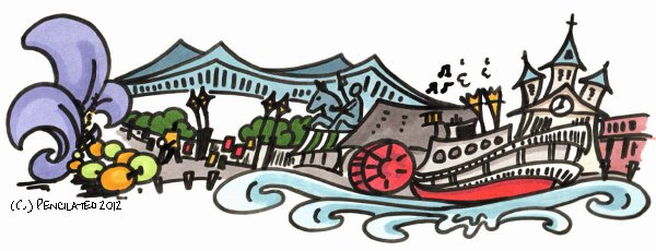
From left to right: homage to the city's French history and Mardis Gras (beads were like ornaments in everything from railings to tree limbs), the Crescent City Connection (twin cantilever bridges), painters set up around Jackson Square, the green and white-striped canvas roof of Cafe du Monde, the statue of General Jackson in the Square, the famous Natchez steam sternwheeler and it's calliope pipes and double stacks, and the Saint Louis Cathedral.

I was lucky enough to catch the calliope in action one afternoon and the happy jazz tunes puffing out of the steamer added a little pep to my pedaling.  I actually knew the words to one of them (thanks to a few years living with grandparents), and joined in with a few sidewalk musicians who bongoed or tapped in rhythm.  The Quarter along the river front became one of my favourite spots in America.


Friday, August 31, 2012

New Orleans, LA - Hotel Monteleone Alley (sketch)

This is the backside of the Hotel Monteleone in the French Quarter; their red-lettered roof sign is visible from I-10 if you happen to be driving through.  I did this to practice that rough sketch look again, but THIS time I did the initial sketch in pencil then overlaid with pen and marker color . . . turned out much better!

Also, I went back to Jackson Square a little later and ran into the ink artist I mentioned in an earlier post who was doing this type of sketch work and I got his info--nice guy.  I'm going to try for this cleaner look that he does since I can certainly see the skill and attention to detail in his sketches, but I'm not entirely sure I want to go that route all the time . . . I LIKE the messy look, both for what it is and because I can clean it up to be either more realistic or stylized.  Also, I heard two people say "It's really tight and on the fly," and "I really like that style," about my work as they were looking over my shoulder.  So.

I'll figure it all out eventually.


New Orleans, LA - 4 Way Fam on Bourbon St (sketch)

I wanted to do another rough sketch like the kind I'd done in Nashville last week, but decided (for some reason) to skip the initial pencil work and just jump right into using a pen.  That fatal decision made this sketch turn out really dark and extra messy, so I'll definitely redo this back in the studio for cleaner lines, brighter colors, etc.

BUT, it so happens that for THIS particular sketch I caught a few guys from Mobile, AL who were in town for some work and to sell a few of their demo CDs; they came over to see what I was working on.  Since we were all artists starting out, I had them autograph the sketch because you just never know, right?  Good luck, guys!


New Orleans, LA - Tap Boys (sketch)

This is what happens when you settle in to sketch out some activity happening across the street and ten seconds later (literally!) the subjects disappear . . . well, they were somewhere around 10 years old, tops, so I should've known better.  The youngest one had taps on his green converse high-tops!

Note to self: carry ones and fives to keep the street performers in one place.

I don't know what I'm going to do with this one.  Probably just file it away as a learning experience.  Ha!


New Orleans, LA - The Arrival of The Nanny (illustration)

This was inspired by a comment made by a little girl while telling a story during a shadow puppet show.  I think it (the illustration) could be either happy or sinister, so if you let any little ones make up a story based on this picture, be sure to let me know which way they go with it!


New Orleans, LA - Frog and Jellyfish Play Ball (illustration)

While the power was out the other night, one of my new friends showed us a quick video of a shadow puppet show her two very young nieces put on for fun based on stories they made up.  One of them was about a Frog who heard a cry outside his house, "Help!  Help!  Come play with me!"  It was a Jellyfish.  The frog went outside and the two played ball and had fun, and all was right with the world.

Inspiration is everywhere if you're open to it.

Naturally, this was done a la story book illustration style.  I think of this and the next one collectively as "pictures to inspire story time."


Wednesday, August 29, 2012

Mobile, AL - City Icons (illustration)

Mobile is Azalea City--everywhere I went, when I asked people what they considered to be a city icon, almost every time the answer started with "Oh, you have to get the azaleas!"  So I did.

From left to right: the city's favorite flowering shrub, Bellingrath Gardens, Bragg-Mitchell Mansion, the government building (designed to look like a sailing ship), two of the city's tallest skyline features (RSA Battle House Tower and Renaissance Riverview Plaza Hotel), the fountain at Bienville Square, and some of the park with its Spanish Moss-draped live oaks.

Everyone should see Mobile at some time in their lives--it's beautiful.  I only recommend the trip occur in the spring (April), when the azaleas are actually in bloom.  (Heh!)


Nashville, TN - Dragon Park (illustration)

There's a huge children's park in Nashville near Vanderbilt University that has some amazing play structures. One of them is this really long dragon statue completely covered in tile mosaic images from various stories--I'll add some of the pictures below for fun.  Anywho, this dragon statue was worth a colorful illustration for the trip.  Caution: artistic license ahead.


Knoxville, TN - The Tin Roof (sketch)

I'm loving this rough-sketch look!  I'll tighten this one up at home, though it'll stay rough like this for the final version.


Knoxville, TN - Butterflies at Cades Cove (illustration)

Still learning my way around these illustration markers.  They have a tendency to smear the india ink when I use them after I've sketched out the lines, so for this sketch I tried doing things a little differently.  The blocks of "wash" were applied first in a loose style, following the color and overall shapes of things I was looking at (the insects, stones, light patterns), then I used the pen to refine those blocks into a recognizable image.

This is one of my favourites from the trip so far and I can't wait to rescan this one when I get back home as this image doesn't do it justice.  It's a small pix, about 4 x 5in., and "very sale-able" I've been told . . . I'm thinking art cards, maybe?


Knoxville, TN - Smokey Mountains (sketch)

Just sort of kickin' around today waiting for the power on the laptop to die, messing around with markers between card games and gusts of wind from Isaac.  Went back into my older photos and did a couple of sketches from Knoxville for later work in the studio.

Despite these two sketches are clearly of trees, they'll probably end up as some abstract painting without the leafy scribble; if you ask me about the painting later I'll probably say something really profound about the symbolism of life's rapid pace in the peaceful chaos of the universe's movement, or the music of the stars and wind represented as love and solidarity. . . I don't know, whatever sounds really artistically profound that really isn't an answer at all.  Or maybe I'll just keep it simple and agree with whatever the viewer thinks it is, but really they're just trees backlit by sunlight.


Monday, August 27, 2012

New Orleans, LA - Jazz at Cafe Du Monde (illustration)

I made myself pick a spot to work on my "people skills," and so I found myself at Cafe Du Monde across the street from Jackson Square.  I ate a plate of beignets first, though.

I figured if I just started with simple line drawings at first to capture the silhouettes, then follow up with the shading, then I might be able to pull this off . . . and it worked!  I celebrated with more beignets.

The jazz guys were moving around so much I hard time getting them down on paper.  Note to self: practice drawing moving targets; order more beignets.